
Overview
Sepsis is a life-threatening medical emergency that requires rapid recognition and intervention. However, early warning signs mimic many other conditions, making detection complex. Hospitals faced a delicate balance—clinicians needed to act fast while avoiding false alerts that contribute to burnout and alarm fatigue.
The previous sepsis detection system was failing due to:
- Severe alert fatigue—false alarms overwhelmed clinicians, reducing trust.
- Extremely long implementation times—some hospitals took 3+ years to deploy the system.
- 0% renewal rates—hospitals were abandoning the product due to its lack of clinical impact.
Our challenge? Completely reimagine the system to ensure faster deployment, fewer false alarms, and real clinical impact.
The Solution
We conducted a nationwide user research initiative, gathering insights from health systems, physicians, and specialists to rethink our approach. Our key breakthrough? Empowering dedicated Sepsis Coordinators instead of overloading frontline physicians with direct, interruptive alerts.
Research-Driven UX Overhaul
- Shifted from physician-targeted alerts to team-based oversight—we designed a new Sepsis Coordinator Dashboard that allowed a dedicated team to monitor sepsis risk across the entire hospital.
- Reduced unnecessary point-of-care alerts—instead of bombarding doctors with disruptive notifications, we centralized alerts, ensuring only high-confidence, actionable cases reached the bedside.
- Built explainable AI insights—alerts were redesigned to include clear clinical rationale, so physicians understood why a patient was flagged, increasing trust and adoption.
- Streamlined implementation—we simplified system architecture by removing dependencies on complex EHR integrations, slashing deployment time from years to months.
- Facilitated clinician collaboration—instead of physicians interacting with an AI in isolation, we designed a system that encouraged real-time dialogue between Sepsis Coordinators and frontline staff for more effective decision-making.
The Impact
67% Reduction in Implementation Time
- Hospitals went live in months instead of years, accelerating access to life-saving technology.
~80% Reduction in False Alerts
- Physicians experienced significantly less alert fatigue, reducing burnout and improving trust in the system.
100% Renewal Rate
- Hospitals stayed with the product, proving its effectiveness in real-world clinical settings.
7-Day Reduction in Sepsis Length of Stay
- Patients with sepsis stayed in the hospital an average of 7 fewer days, leading to better health outcomes and $15K in cost savings per patient.
Key Takeaways
- Human-centered design can be the difference between adoption and failure—by listening to real clinicians, we turned a high-noise, low-trust system into a critical hospital-wide asset.
- Simpler implementation drives impact faster—cutting complexity allowed hospitals to adopt life-saving tools in months, not years.
- Collaboration, not automation, is key to better care—instead of replacing clinical judgment, we designed a system that enhanced teamwork, leaning on real humans to essentially bootstrap trust in our alerts.
- Designing based on reality – we were working with a sepsis detection algorithm that was far from perfect. To accommodate, we completely reimagined how to deliver imperfect alerts by greatly reducing interruptive alerts, and shifting the majority of alerts into a passive mode with more of an evaluative feel.
Skills & Techniques
- Ethnographic User Research
- Contextual Interviews and context modeling
- Lo-Fi Prototyping
- Sketching (Balsamiq)
- Executive pitches
- User Testing
- Product ownership and dev team lead
- Figma design system creation
Designs
The Original Product
Obviously, the original interface leaves a lot to be desired. A lack of prioritization, organization, hierarchy, action affordance…the list goes on.
However! There were some really great ideas in here that just needed to be reimagined.
Reimagined Workflow
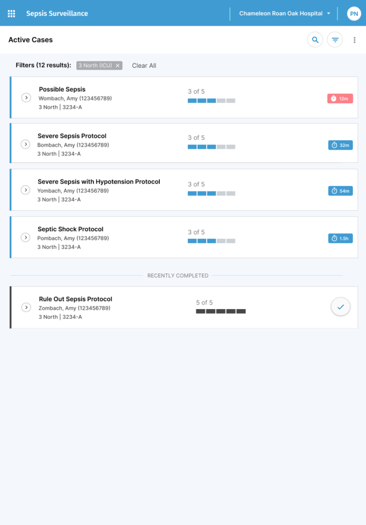
As mentioned, we completely re-imagined the product. Instead of being catered to point of care teams, who would traverse the system patient by patient, we built a system catered to specialists (Sepsis Coordinators or designated nurses) who would quarterback all sepsis patients at any given time. To do this, we built a home screen that showed:
- All active sepsis cases across the entire hospital
- Current “Bundle” status viewable at a glance
- A significant challenge with sepsis is that it’s extremely time sensitive. For every 1 hour delay in treatment, odds of poor outcomes and death increase 3-7%. These required steps are referred to as the “Sepsis Bundle”.
- Remaining time until deadline viewable at a glance
- Each bundle step also has a completion deadline. Missing the deadline results in a failure for regulation purposes. Failing sepsis bundles has significant repercussions.
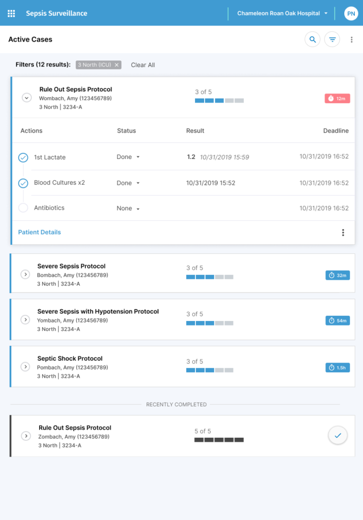
Patient Insights at your Fingertips
- Drilling into active cases shows details of the patient’s current bundle status and lab relevant lab results and orders. This data is scattered all around the EHR. Bringing it together in one easy view saved time searching for data, but most importantly, aided in decision-making by reducing the cognitive workload of requiring users to remember the data as the traversed through all the patient data.
- Clear indications of active status, remaining steps, relevant patient data, and deadlines make decision-making simple.
Empowering Users with Information
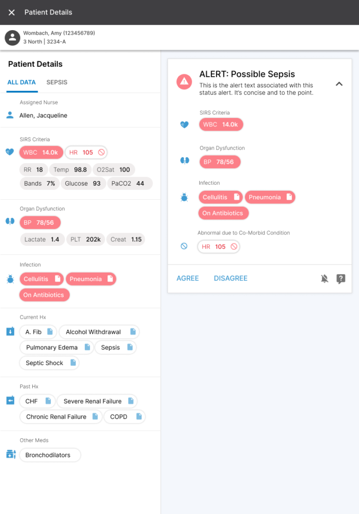
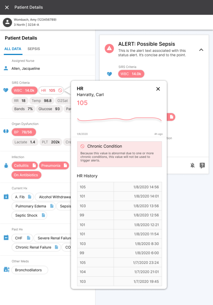
A really interesting observation we made while doing on-site, ethnographic research was an unfortunate power dynamic between nurses and physicians. Nurses were the user at the point of care seeing alerts, but they were too afraid or completely unempowered to do anything about it. A big issue we noticed was a drastic difference in vocabulary when talking about sepsis. With this view, we aimed to arm nurses with everything they would need to advocate for intervening on a patient. They have the data, the criteria, the vocabulary, and the context, all wrapped up into one view.
- Designed to be completely responsive, with the idea in mind that a user could bring our app on an iPad to the point of care to help convey ideas and reference data that is otherwise scattered in the EHR.
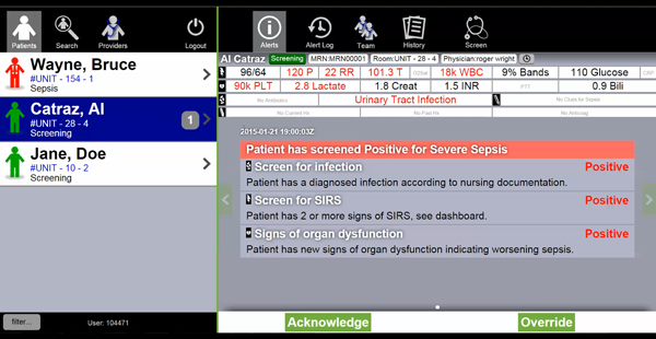
- Clicking into an active case presents the user with everything they need to know. The areas on the left with Red labels are organized by Sepsis criteria, making the reason the patient is qualifying as an active sepsis case very clear. The diagnostic definition of Severe Sepsis is:
- SIRS (e.g. high WBC)
- Infection
- Low Blood pressure
- Natural Language Processing (NLP) was used to organize and extract information from clinical notes. A great feature we built in was that you could click onto the indicator saying the patient has cellulitis, and we would prove the specific note and even highlight the associated text that qualified the note as indicating cellulitis – no guesswork in the EHR necessary.
Big Changes, Big Results
The underlying data powering our detection algorithm was imperfect and convoluted. We went out of our way to make its evaluations as transparent as possible, going as far as conveying why alerts WEREN’T firing for a given patient (e.g., while their current HR might qualify as SIRS, this patient is diagnosed with CHF and A. Fib, and therefore has a chronically high HR. Accounting for these types of common occurrences is extremely difficult, and a huge reason why most sepsis solutions are extremely, EXTREMELY, inaccurate).
By moving the bulk of our alerting system out of the interruptive modality, where we were annoying and often completely unhelpful, and putting the responsibility on passionate people, we saw the huge changes in outcomes. It simplified our product, simplified our message, and helped our customers save lives.